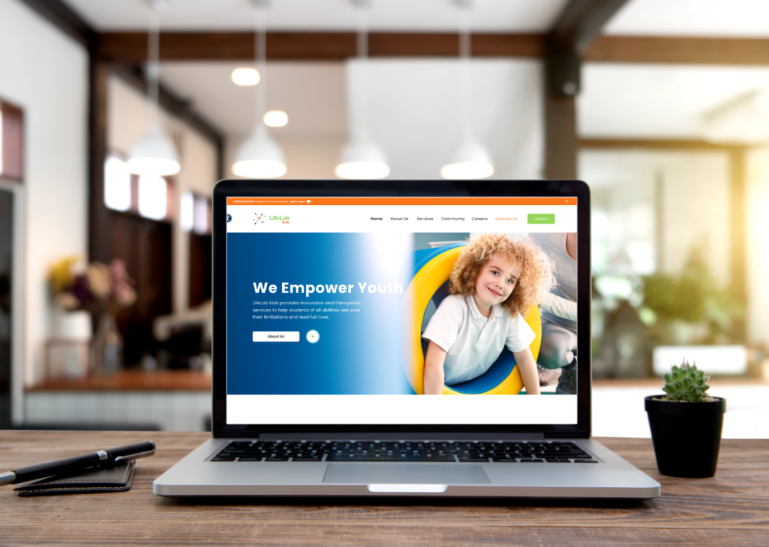
Life Lab Kids Live Website
-
Role
UX Designer
-
Tools
Adobe XD, Adobe Illustrator, Adobe Photoshop, Miro Board, JIRA Board, Confluence
Overview
Lifelab Kids provides specialized training, support, and resources for individuals with autism and their families. The organization aims to increase accessibility to high-quality autism resources and offer workshops and support programs. They need a website to raise awareness, offer resources, and receive donations to support their mission.
My Process
- Research
- Define
- Ideation
- Prototyping
- Testing
- Design Handover
Research Findings
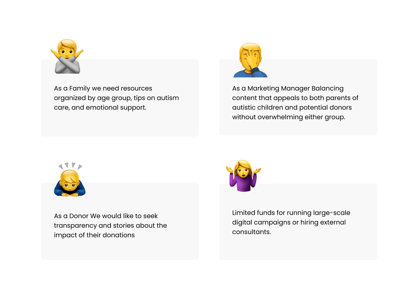
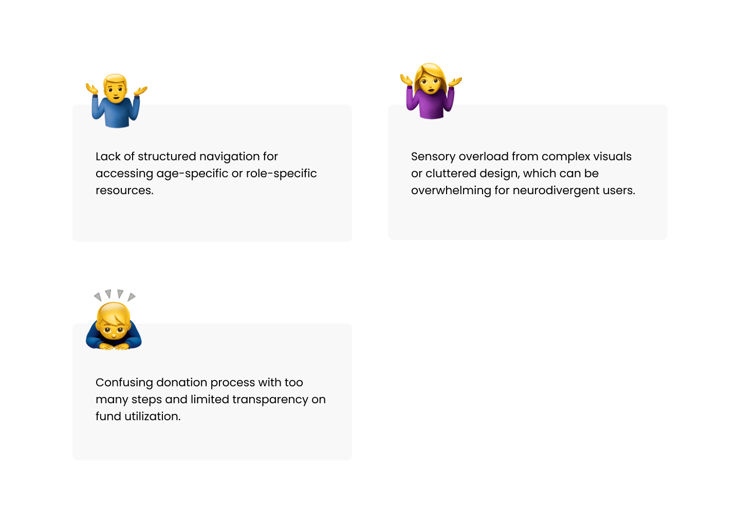
We conducted Stakeholder and different type of User Interview with families, educators, and potential donors
Insights
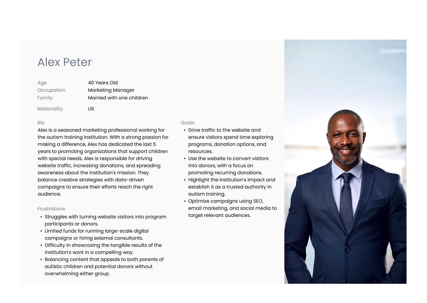
Personas
We defined Personas in order to stream line our findings.
User Journey
Based on the personas we created a user journey which helps the team to understand and empathize with users.
Scenario -
Lisa is a devoted, hardworking mom who recently moved to a larger city to find better support and resources for her son, Ethan, who has been diagnosed with autism. Ethan’s needs include social skills development, communication training, and support with sensory processing challenges. Lisa wants to help her son thrive, but she feels overwhelmed by the variety of available programs and unsure which will best suit Ethan's needs. She doesn’t have a high income and is concerned about finding an affordable, effective program.
Design Decision
Once we are done with the Journey Mapping we came to the conclusion that each persona experience peaks of satisfaction and connection during specific stages with different challenges. Inorder to satisfy the user needs we connected again with the Stakeholder with our findings. We created a rough draft on the features to be added as per the research findings.
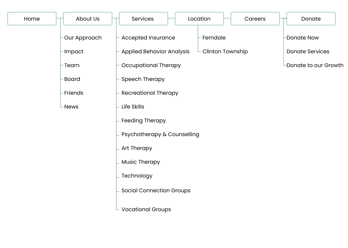
Site Map
We decided to create the sitemap with the decision discussions we have and will be followed by a wirefram mockup based on the user research, stakeholder and marketing team inputs we create wire frames with the initial copy received from the copy team.
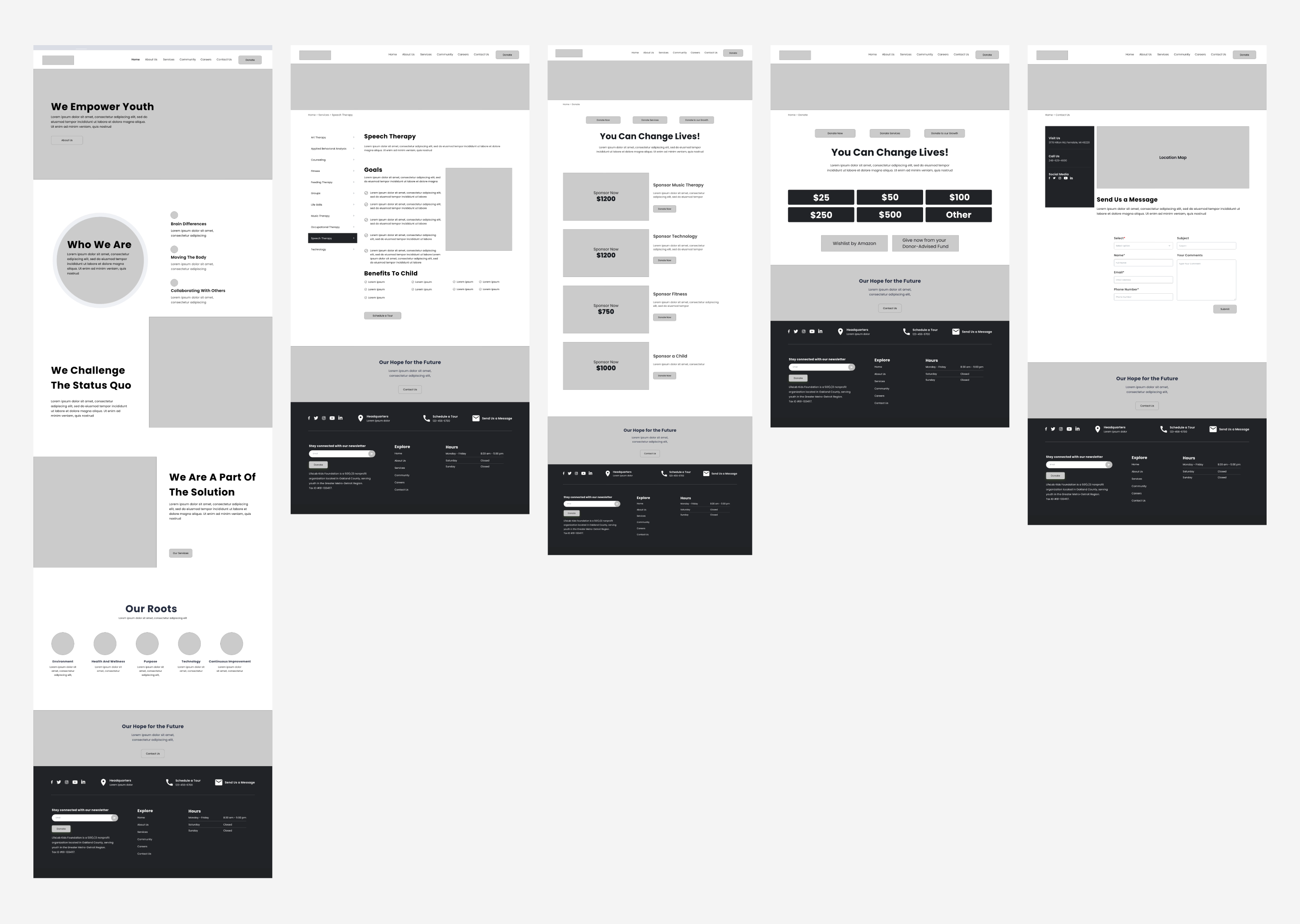
Wireframes
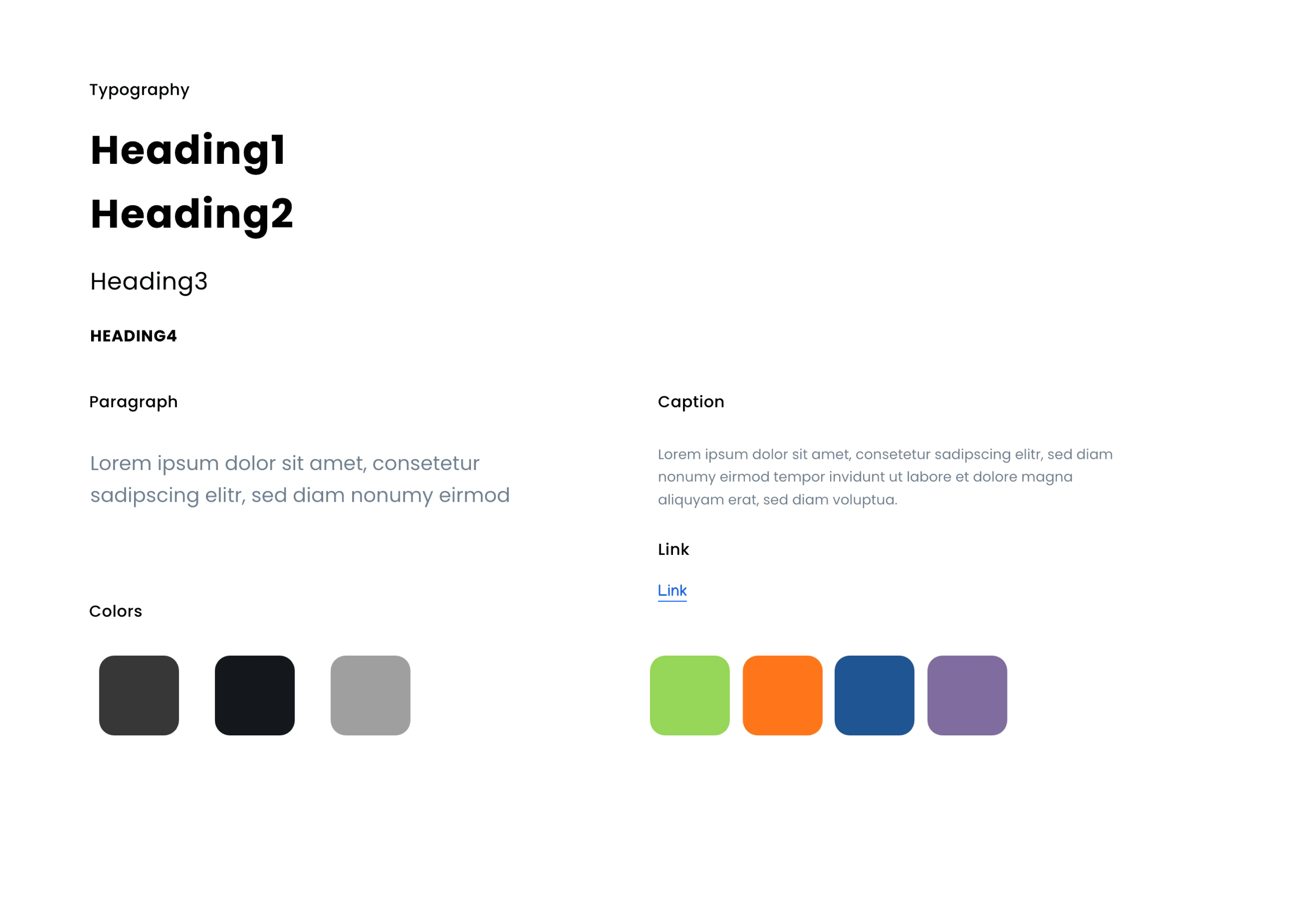
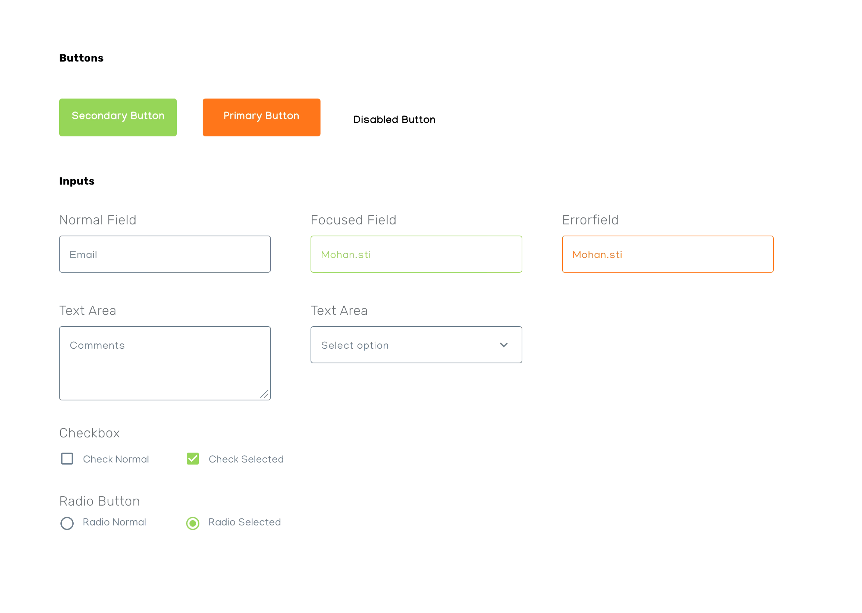
Style Guide
We decided to create the sitemap with the decision discussions we have and will be followed by a wirefram mockup based on the user research, stakeholder and marketing team inputs we create wire frames with the initial copy received from the copy team.
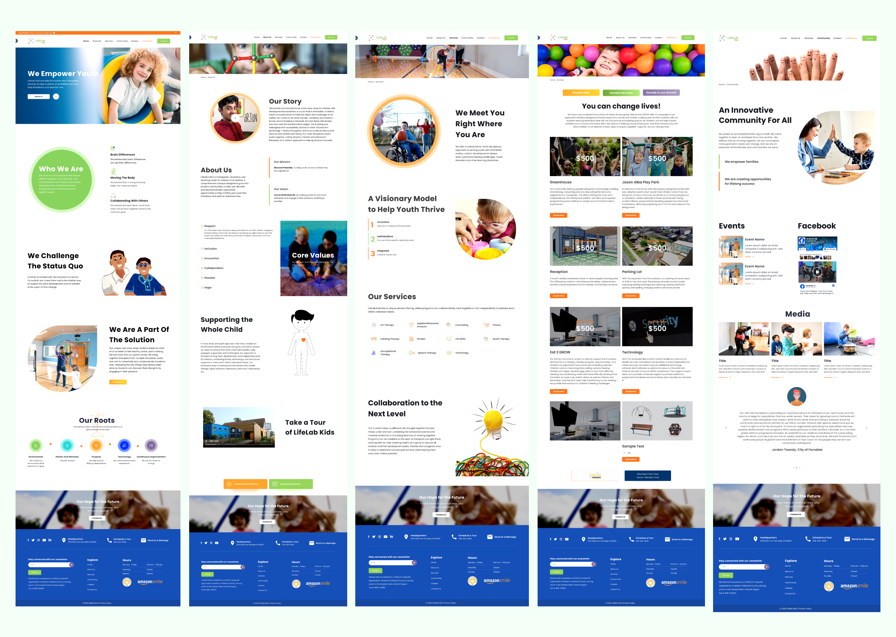
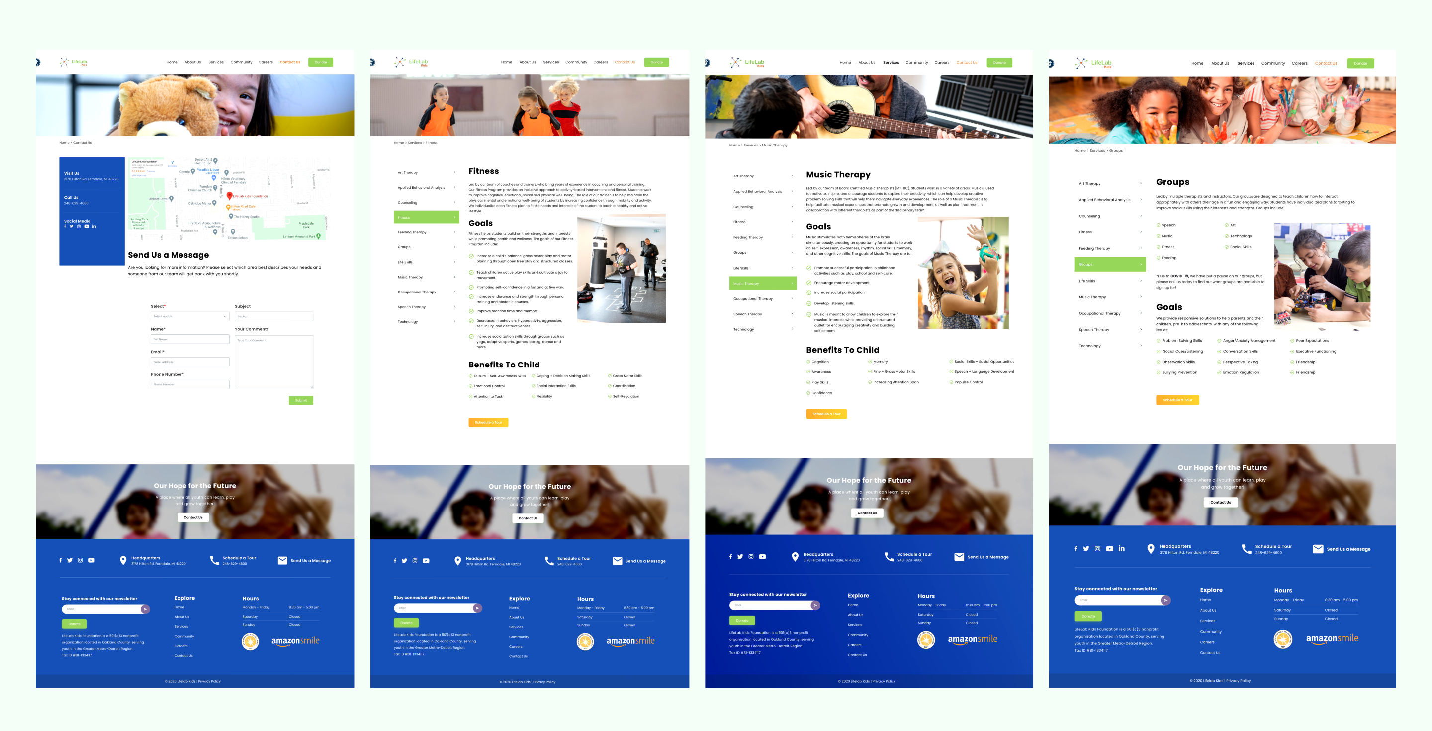
Desktop Visual Design
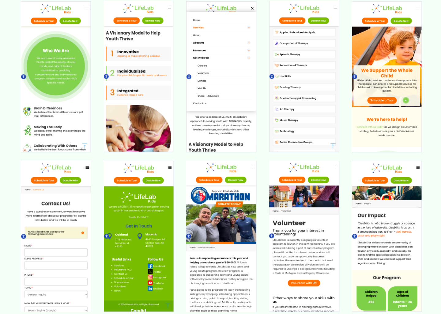
Mobile Visual Design
Usability Testing
Once we complete the Visual Design we conducted Remote and In person Usability Testing with the help of moderators by giving the users particular tasks to complete and share the feedback. We recorded the time taken to complete the tasks and also the user behaviour while navigating through the website.
Testing Objectives
1 Ease of Navigation: Test how easily users (families, educators, and donors) can find relevant sections.
2 Donation Flow: Ensure that the donation process is straightforward and builds trust.
3 Accessibility for Users: Test if sensory-friendly features are effective and easy to use.
User Testing Findings
- Positive Feedback on Navigation: Users liked the easy modal navigation and found it easier to locate relevant content.
- Donation Page Trust Signals: The transparency elements on the donation page (e.g., Donation) led to a 30% increase in user confidence.
- Accessibility Adjustments: Users were facing difficult with the accessibility points like color contrasts and visual cues.
Improvements
Integrated 3rd part Accessibility widget to improve the Experience and received good feedback from the users and the Marketing Team.