One Project.
3 Weeks.
One Designer.
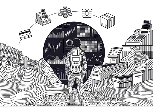
01 OVERVIEW
A North American FinTech provider needed a production-grade point-of-sale system — Android app plus web admin portal — built and shipped in eight weeks (3 weeks for UX). This is the story of how we made fast feel deliberate.
02 ROLE
Startup Journey
After years of working across multinational companies in diverse domains, I felt the need to challenge myself and step out of my comfort zone. I embraced an opportunity with a startup in a completely new role and industry—marking my first experience in this space. This journey wasn't just about applying my existing skills; it was about immersing myself in an unfamiliar domain, learning quickly, and delivering meaningful impact within a short timeframe.
Outcomes
- Reduced onboarding friction with a streamlined, zero-friction setup flow
- Unified payment experience across multiple payment methods
- Scalable multi-merchant design supporting 20,000+ users seamlessly
- Faster task completion for catalog, checkout, and reporting workflows
- Improved trust through clear feedback, error handling, and transaction visibility
- Consistent cross-platform UX between mobile POS and web admin
- Data-driven dashboards enabling quick business decisions
- High performance & reliability with reduced crashes and smooth transactions
- Accelerated delivery — production-ready platform built 3x faster
03 KEY CHALLENGES
Finding clarity and purpose within complexity.
Challenge
As the sole UX designer for a large-scale FinTech POS platform, I was responsible for shaping the end-to-end user experience across multiple parallel workstreams:
→ Multi-Merchant POS Experience
→ Payment Flows & Checkout Optimization
→ Web Admin & Back-Office Experience
→ Onboarding & Merchant Configuration
The challenge wasn't just delivering fast—it was crafting a scalable, high-performance UX that could support over 20,000 merchants while maintaining clarity, consistency, and trust across every interaction.
Solution
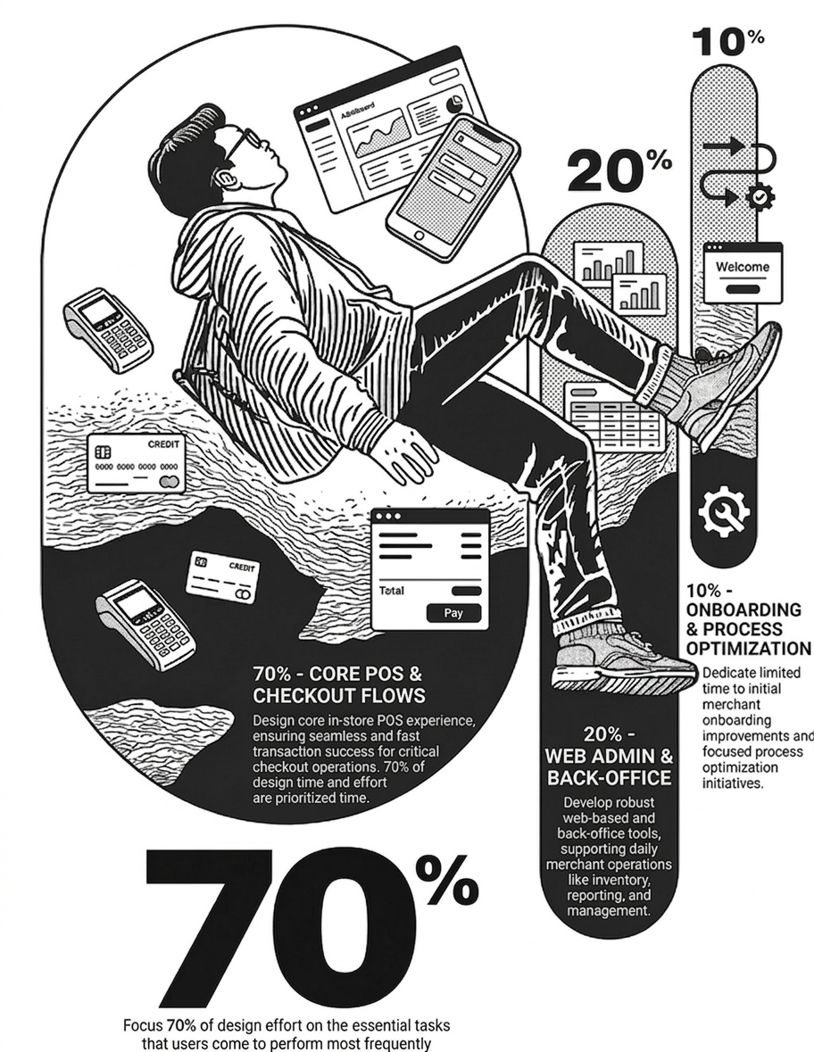
With multiple high-impact workstreams running in parallel and an aggressive delivery timeline, I needed a clear prioritization strategy to stay focused and effective. I adopted the 70-20-10 approach to structure my efforts:
70% focused on the core POS experience and checkout flows (critical to transaction success) and also referring the documents shared by the research team based on their insights which includes scope and target users.
20% dedicated to the Web Admin and back-office experience (supporting daily merchant operations)
10% allocated across onboarding improvements and process optimization initiatives.
The 70-20-10 Rule
Weekly Breakdown
To manage multiple workstreams within a tight timeline, I structured my week around focused 90–120 minute deep work sessions. While priorities often shifted, I ensured consistent time for the most critical areas.
Monday – Thursday
→ 4–6 hours: Deep work on core POS experience and checkout flows
→ 2 hours: Web admin and back-office improvements
→ 1 hour: Onboarding flows and process optimizations
Friday
→ Morning: Focus on onboarding enhancements and operational improvements
→ Afternoon: Plan upcoming work, align with teams, and close pending tasks
This approach helped me stay focused on high-impact areas while remaining flexible to adapt to evolving project needs.
Dealing with Reality
With multiple workstreams and a tight 8-week timeline, things often shifted. I kept a flexible structure to stay on track without losing momentum:
Handling urgent issues
Set aside buffer time in the afternoons to quickly address blockers in POS flows, payments, or onboarding
Adapting to changing priorities
Rebalanced focus across POS, checkout, admin, and onboarding based on business needs, while keeping stakeholders aligned
Managing energy for better output
Used peak hours for complex UX problems like checkout flows and system design, and lighter time for documentation or reviews
Daily show & tell with stakeholders
Shared ongoing designs in standups to get quick feedback, validate decisions, and iterate faster
04 UX DESIGN
Straight to the Point, Built for Speed
Problem
Limited bandwidth
As the only designer, balancing multiple workstreams meant some designs moved to development before being fully detailed
Design–development gaps
Lack of alignment led to back-and-forth during QA, increasing time spent fixing avoidable issues
No structured user validation
Without proper testing, there was a risk of building features that didn't fully meet user needs
Solution
Leverage existing solutions
Identified opportunities to use proven, off-the-shelf patterns to cover most requirements quickly
Introduce design tokens
Created a shared system to bring consistency across design and development, reducing rework
Prototype and validate early
Focused on quick prototypes to gather feedback sooner and refine features before development
PayOff
Faster delivery cycles
Reduced design-to-development handoff time by 60% through clear design systems and documentation
Improved quality
Fewer QA iterations and post-launch fixes through early validation and consistent patterns
Better user satisfaction
Higher task completion rates and reduced user errors through validated, familiar patterns
UX Strategy
70% Familiar
Our approach was grounded in Jakob's Law—users expect products to work the way they're already used to.
Instead of reinventing patterns, we leaned on familiar design conventions from widely used apps and platforms. This helped users navigate effortlessly using what they already know, reducing confusion and learning time.
By keeping most of the experience familiar, we lowered cognitive load and made interactions feel intuitive—allowing us to focus innovation where it truly adds value.
30% Magic
While most of the experience followed familiar patterns, the real value came from refining the details. In a transaction-heavy POS system, small decisions—like hierarchy, spacing, feedback states, and content clarity—directly impact speed and confidence.
By focusing on these nuances, we made complex flows like checkout, payments, and reporting feel effortless—helping merchants complete tasks faster and with fewer errors.
Design Foundation
The Power of Boring
With limited design bandwidth and no scope for deep user research, I grounded the UX approach in Jakob's Law—users expect products to work the way they're already familiar with.
Taking cues from widely adopted POS systems like Square App after conducting a research, I focused on using established patterns and interactions to create an experience with minimal learning curve. This helped reduce onboarding time, improve usability from day one, and allowed the team to move faster by building on what users already understand.
The UX Model Square POS App


Fonts - We chose this typography because it is scalable, developer-friendly, familiar to users, and aligned with industry patterns for a seamless experience.

Icons - We used Google Material Icons for their extensive library, easy Figma integration, and strong documentation, enabling faster and smoother development.

Colors - We chose to align with familiar user perceptions, ensuring intuitive understanding and consistency across the experience.

Grids - Designed on a 360px base width using a 4-column grid with 16px margins and 8px gutters, ensuring consistency, readability, and easy scalability across different screen sizes.
The Magic 30%
With the core experience grounded in familiar patterns, the focus shifted to refining the details that truly elevate usability. Subtle improvements in hierarchy, feedback, and interaction design helped turn complex payment and operational flows into something intuitive and efficient.
These refinements made everyday tasks—like checkout, reporting, and management—feel smoother, faster, and more reliable for merchants. Let's look into couple of Interaction designs based on the flows created.
Design Insights
Speed First UX
We will keep every core flow within three taps, redesigning anything that adds friction to ensure consistently fast interactions.
Cognitive Simplicity
We will minimise cognitive load by showing only what's necessary at each step, enabling quick, error-free decisions through progressive disclosure.
Design decisions that could not be undone post launch.
Every UX choice had to survive production at scale.


04 UX DESIGN
Journey Ends
This journey challenged my adaptability and sharpened my focus, pushing me to grow in ways I didn't anticipate. Here are a few standout moments.
Winning Moments
- Delivered end-to-end, solo
Led the entire UX across POS, payments, admin, and onboarding—owning design from concept to delivery - Stayed focused with 70-20-10
Prioritized high-impact flows like checkout and POS, while still progressing supporting areas - Adapted quickly to FinTech
Got up to speed with payments, merchant workflows, and system constraints to deliver effective, real-world solutions - Shipped under pressure
Delivered a scalable, production-ready experience within an aggressive 3-week timeline - Built for scale from day one
Designed a system that supports 20,000+ merchants with consistency and reliability
Lessons Learned
- Balance familiarity with precision
Used established POS patterns (Jakob's Law) for usability, while refining UI details like hierarchy, spacing, and feedback to improve clarity and speed - Move fast within constraints
Leveraged existing patterns and systems to avoid reinventing the wheel and accelerate delivery - Stay adaptable
Rebalanced priorities across POS, payments, admin, and onboarding as needs shifted, while keeping stakeholders aligned